Murakami Exhibit
Tasked with creating an interactive museum exhibit for the Superflat art movement that includes both digital and physical touchpoints to create an embodied experience.
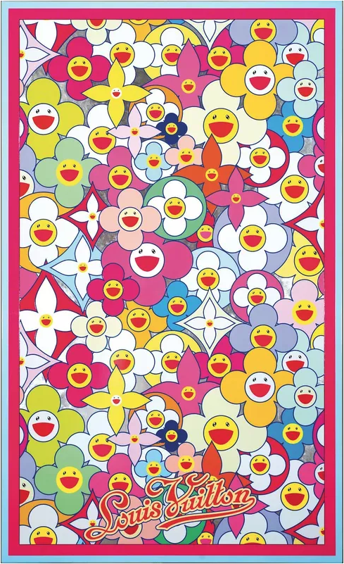
(P.S. These Murakami Flowers can be dragged across the screen)
-
November 2020 - December 2020
2 ½ weeks
-
During this project I participated in different parts of the ideation process like sketching and gathering research. I also coded the accompanying website using HTML and CSS.
-
This project was in Fall 2020, during the height of covid, so the team was working completely remotely across America in different time zones.
-
Cultural Probe, Interviews, 3D AutoCad Development, Literature Review, Formal Evaluation
Narrative Arc
After completing some secondary research about the Superflat Art Movement the team decided to focus primarily on the creator of the style, Takashi Murakami.
We learned about the dark meanings behind Murakami’s art that reflect Japan post-World War II consumerism. Our team decided to focus on the themes of escapism and loss of individuality through the rise of consumerism after the tragedy of the atomic bomb attacks as the events heavily influenced his art.

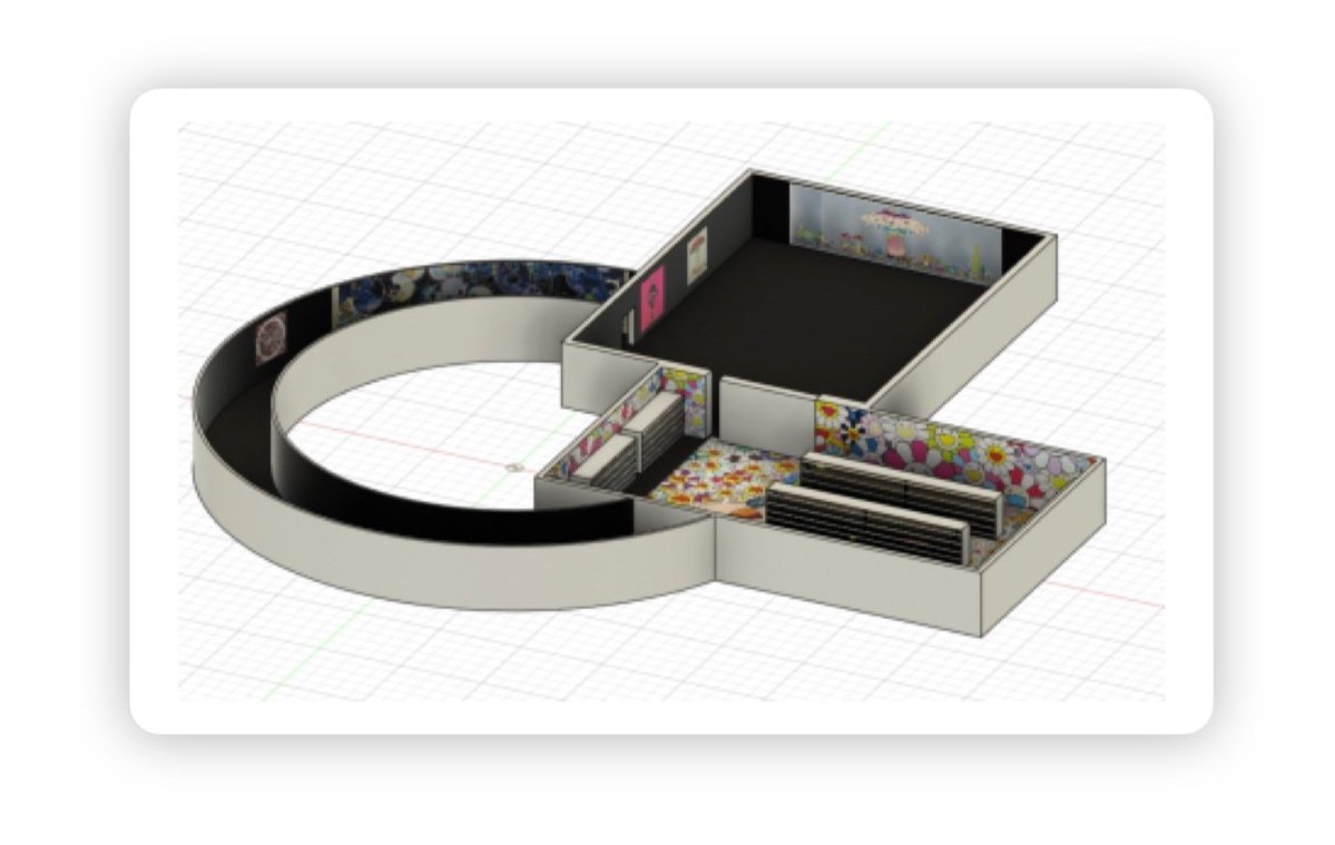
Exhibit Map
The exhibit consists of three distinct spaces that begin and end in the same room.
-
Consumerism Room
Guests enter into this consumerism room covered in Murakami’s bright, obnoxious artwork causing them to feel happy and excited. This room is meant to feel a overwhelming and overstimulate the guests to reflect Murakami’s views on Japan’s consumerism.
Each guest receives a token when they enter the exhibt. A giant vending machine acts as a door into the second room that once this token is sliped into the coin slot, it opens up to see the darker cause of the consumerism.

-
WWII Room
In this room the ceilings are low, the temperature is a little warmer, and it is much darker. This is done with the intention of making the visitor more uncomfortable.
The warm temperature and darkness of the room cause the guests to almost want to ‘escape’ the room, and reflect on how the atomic bombs caused a severe version of this feeling.
The art present in this room is filled with pieces that were made before Murakami developed his iconic style and are all focused on the bombing itself.

-
Escapism Tunnel
The idea of a tunnel was chosen to help emphasize the feeling of escapism in the exhibit. We wanted the guests to feel like they were traveling somewhere, only to end up right back where they started, the Consumerism Room.
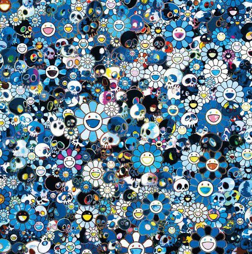
The tunnel would get brighter as the tunnel got closer to the Consumerism room. This would help the guests understand the rebuilding of Japan to what it is now. The walls display Murakami’s darker variations of his flower art now with skulls which challenge the previous conceptions of Murakami’s symbolism in his work, as these happy symbols are seen in a different environment.
This gradual transition provides a relief in the tension created during the previous section of the exhibit. Visitors also have a period of time to reflect on the changes before looping around and returning to the pop-up shop they entered through.

Examples of artwork featured in each room

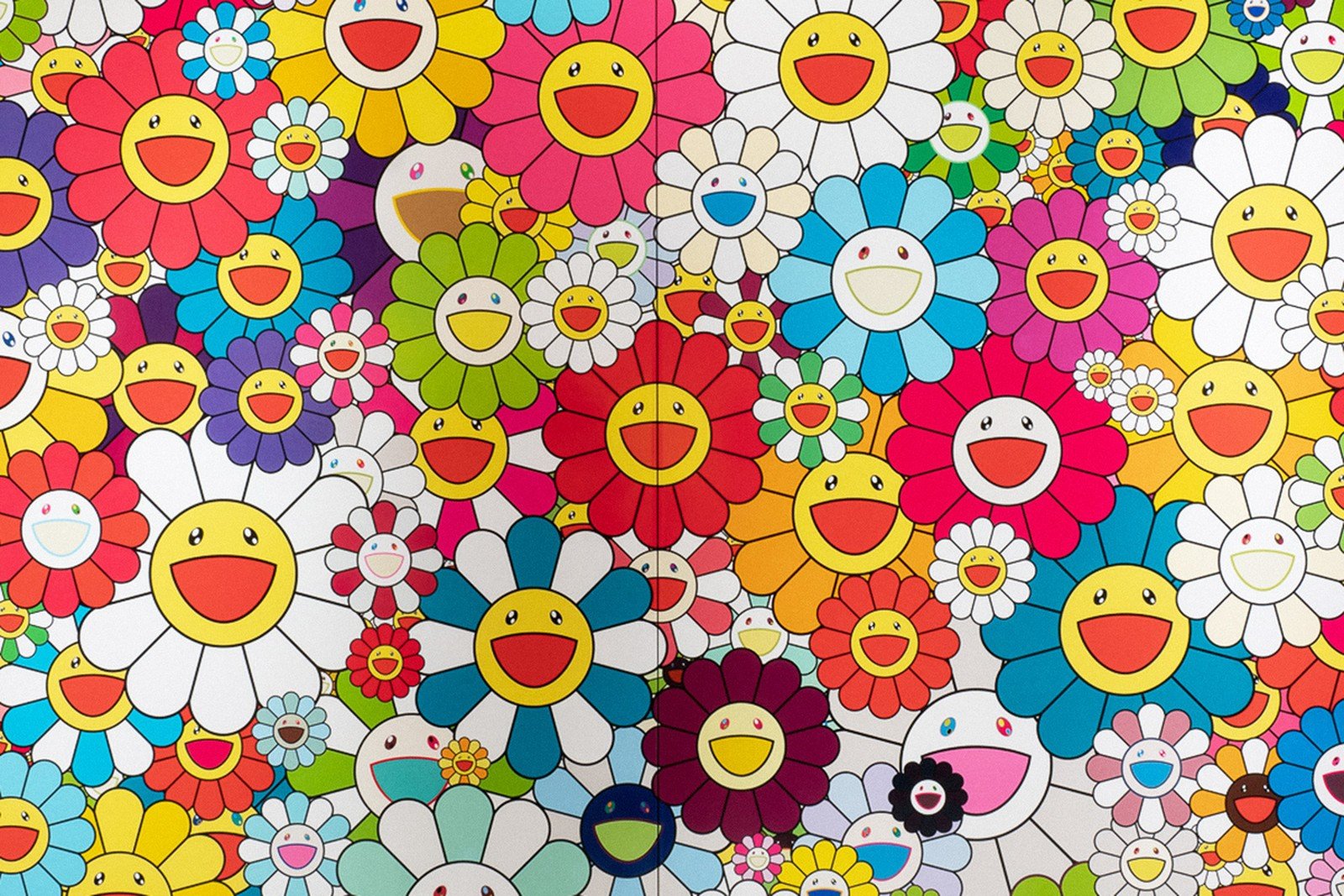
Consumerism Room
WWII Room

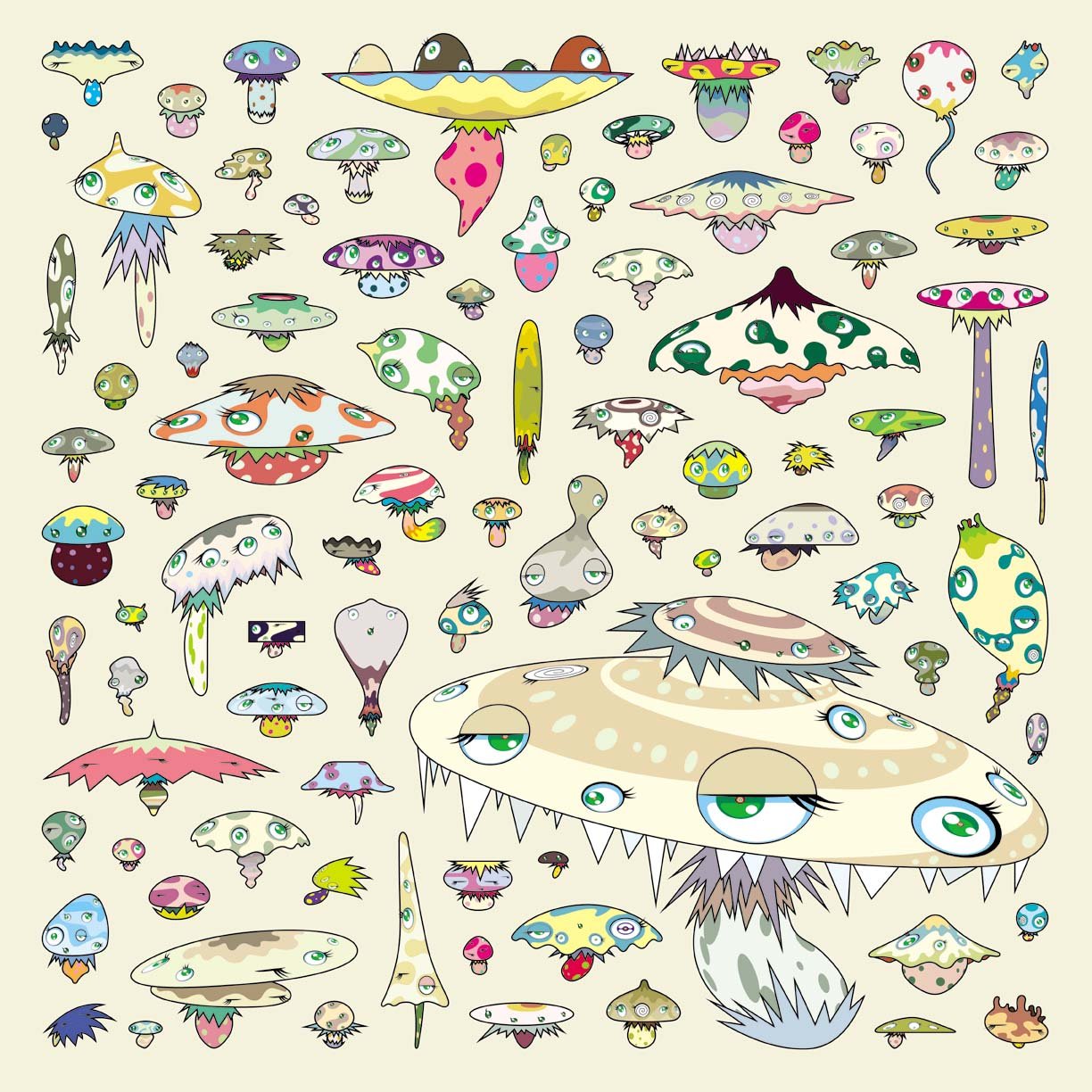
Escapism Tunnel

WWII Room
Escapism tunnel
Consumerism Room

when visitors complete the loop and return to the consumerism room…
There is a new spark of understanding that the bright and colorful exterior presented in Murakami’s work is a way of coping in a society that has been affected by a major tragedy.


QR codes
Throughout the exhibit, QR codes are posted on the walls so that visitors can learn more about the art displayed. When visitors scan the QR code with their devices, a link will be opened which displays information about the characters in the corresponding art piece. The website was coded by me.


Cultural Probe
In order to understand the significance of colors in peoples everyday lives, as well as the meaning they associate with them we conducted a cultural probe.
We asked our participants to color in a petal from a Murakami flower every hour for twelve hours to represent the emotion they felt during that time. Along with this they would give an explanation, specifying why each color was tied to the emotion they chose.